Zoomed images on iOS
28th February, 2020
I’ve been working on a wedding website for my upcoming wedding to my amazing fiancé Elina in August. The website is intended to be a place where we can share the details and the guests can RSVP easily. Not flying to far away from the current design trends we have made quite heavy use of parallax scroll. However it has been a few years since I’ve done this and I can see now you can do simple and even some more complex parallax scrolling in pure CSS instead of JS listening to scroll events which unless you are careful can get janky quite quickly.
Everything was going smoothly. I picked up Sizzy which is really amazing for seeing your site at multiple resolutions very easily. Now everything is done - the parallax is all nice and smooth even with a throttled CPU in dev tools. I push it to a PR and the netlify preview loads. I confidently send the link to Elina and she goes
Uh… what is with the images? Are they meant to look like this?
I load it up on my phone and see they do look crap - they are zoomed in awfully.
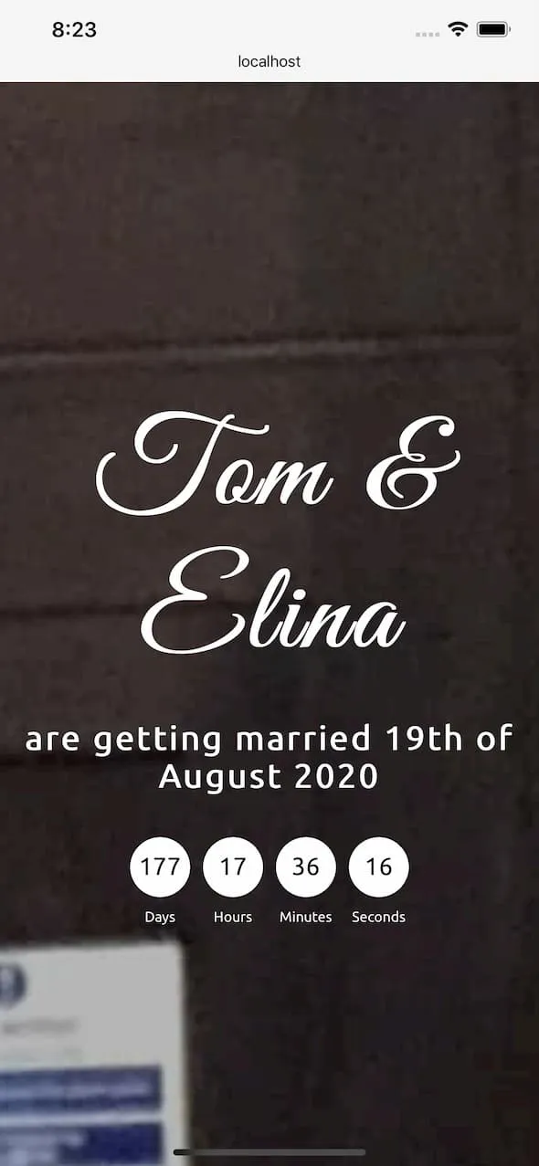
I do think fire safety is important but I’m not sure it should be the first thing people can kind of read on a wedding invitation website. That’s just not good UX. 💩
So 10 minutes of googling later I find out that iOS have issues with background-attachment: fixed in combination with background-size: cover. Which is a little annoying but I guess this is what web development is all about.
So I decided to drop it on iOS and then once they have fixed the issue we can re-enable it.
The quick fix to disable it was this:
@supports (-webkit-touch-callout: none) {
  background-attachment: initial;
}
This media query targets only mobile safari devices and sets the background-attachment as if none was set. This fixed the issue and now the wedding website can go out and collect RSVPs whilst Elina and I go back to debating more important things for the wedding.